Challenge
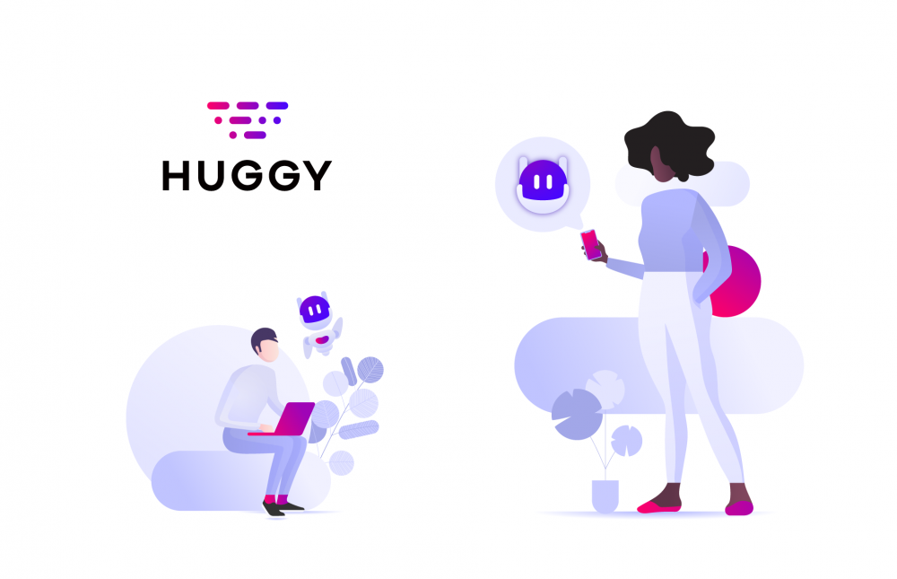
Huggy – previously called PowerZap, in a direct allusion to the Brazilian nickname for WhatsApp – is a company that provides different types of business with an omnichannel digital service management system. They came to us a few days after the name change, which represented the moment when the product and the company’s own business model were being restructured, and we were asked to help them unlink their brand from Whatsapp and, in the process, realigning them verbally and visually to their new goals. Thus, in this project we should develop a new Purpose of Brand, Positioning and Visual Identity.

Brand Strategy
During our immersion process, we realized that the mindset of the company was very much focused on the idea of bringing brands and people together so that the relationships between them could be richer and longer lasting. We condensed this newly discovered Purpose on a tagline, which from then on would be Huggy’s mantra. We searched for a phrase that emphasized the connection between real people, with an air of informality and a great deal of optimism and motivation, but that did not fail to describe, even in a subtle way, what the platform would effectively offer.
It seemed clear to us that the result should be a question; a simple way to demonstrate an interaction between two parties: “Shall we talk better?”. The tagline also makes clear the biggest practical differential of the Huggy platform, which is to improve communication between brands and customers.

Visual Identity
In order to capture the spirit of the brand visually, we sought a vibrant, intelligent identity that conveyed an idea of integration, and that was aligned with the aesthetic precepts of new technology companies.

It occurred to us that the Morse Code is a visually interesting universal form of communication. It’s universality and its simplicity could express the interconnection between the various communication channels on the Huggy platform and the efficiency generated by the use of it.
Through the visual transcription of the Morse Code – the dot and the dash – we built a symbol that forms the word “Hello”, reinforcing the proximity of the brand. The conical layout refers to an idea of propagation and communication, in addition to giving dynamism to the symbol. The lettering was built in a geometric and imposing font, creating a balance with the meaning and sonority of the name Huggy, which leans towards the concepts of friendship and empathy.

