Challenge
Vesper is a Venture Builder whose mission is to help entrepreneurs transform their most innovative ideas into great successful companies. By working with carefully selected clients and acting side by side on management and fund-raising, the team features some of the top fast-growing national companies from the last few years. Bradda’s role in the project was to create a name, a brand and a Visual Universe which associate this company’s great efforts to a boosting and inspiring theme.
Naming
The name Vesper was inspired by astronomic and celestial aesthetics, in order to approach themes like journey, precision, dreams and legacy. Vesper is one of the many names given to the planet Venus, which can be seen as the most brightful “star” in Earth’s sky. For that reason, it is frequently the first sighting or the last remainder from a starry sky, and it is associated with positive beliefs in many cultures. These are characteristics that relate to the company’s pursuit for excellence. Syntactically, Vesper is a sonorous, imponent, precise and fast word – qualities associated with high-performance companies.

Visual Identity
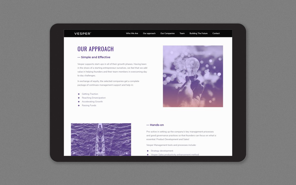
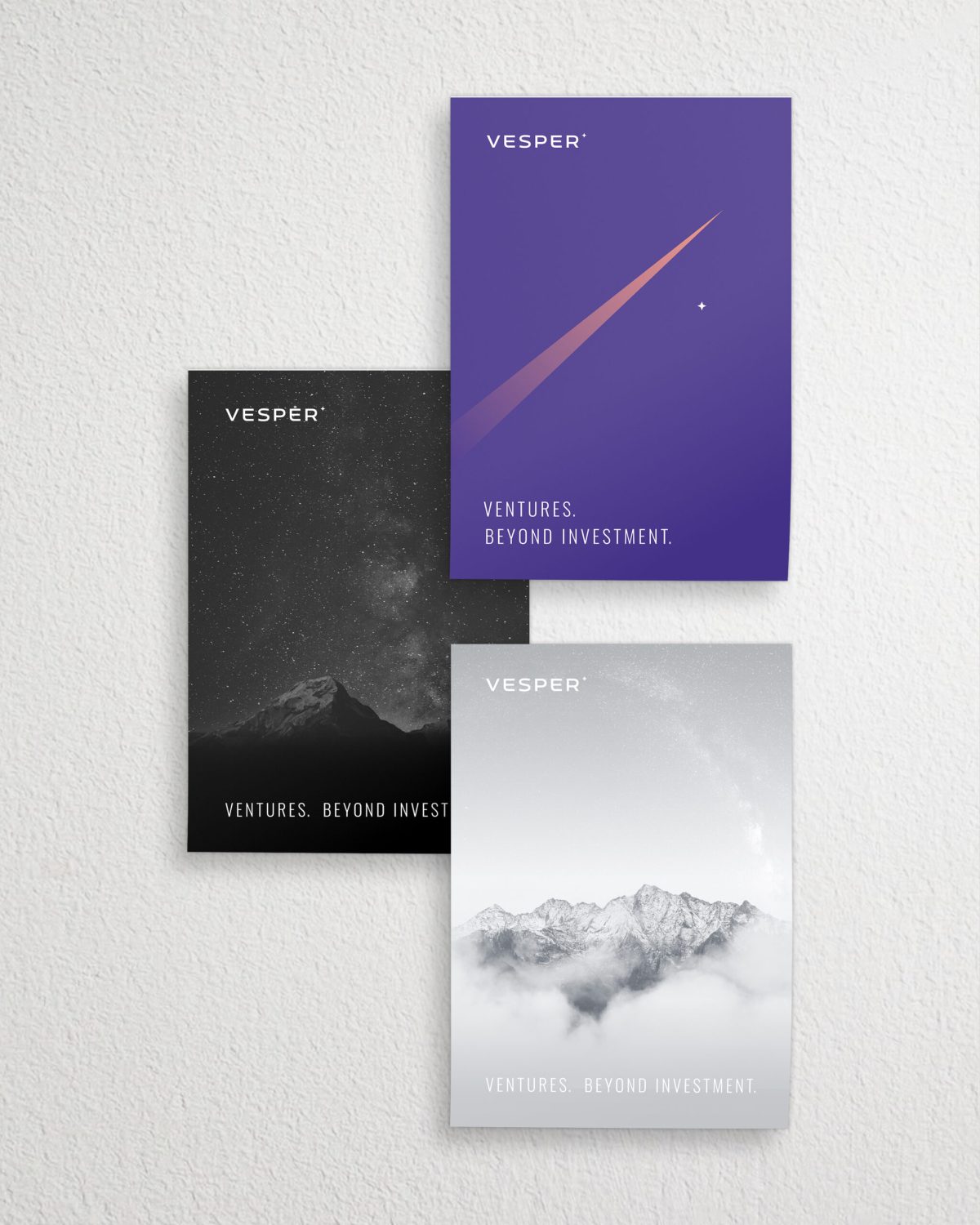
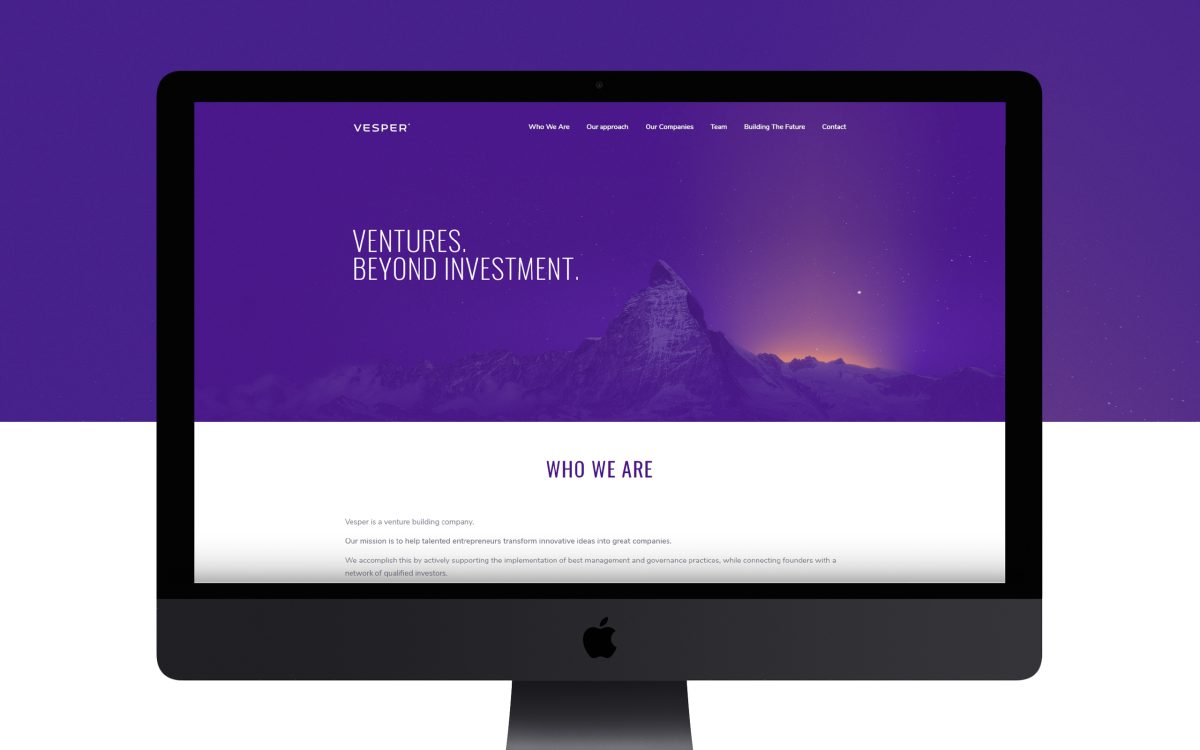
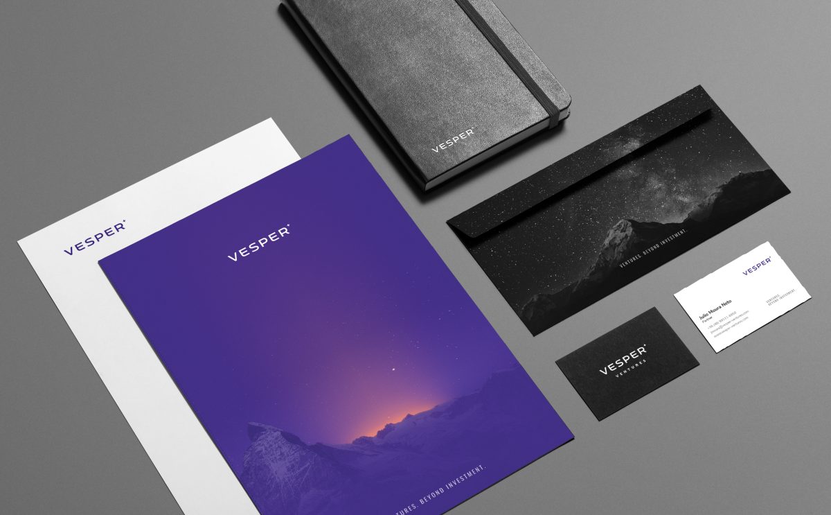
Vesper’s visual identity follows the lines of visual minimalism along with a subtle spacey style inspired by the project’s recurring theme.
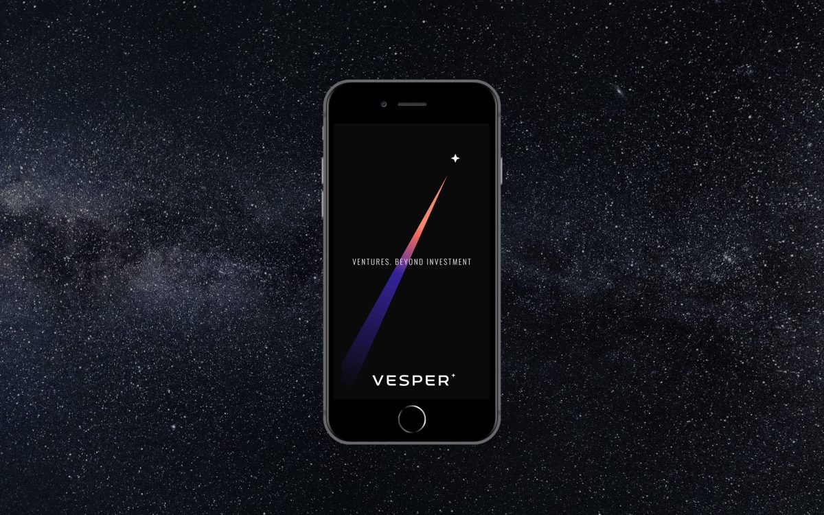
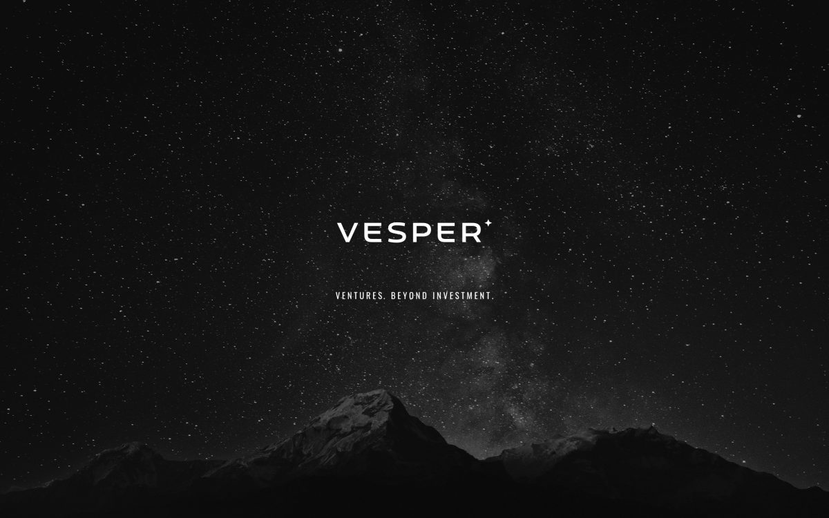
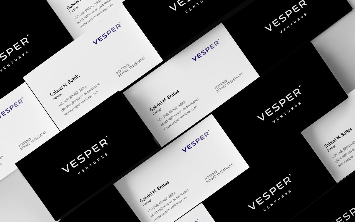
The Vesper logotype is built by a contemporary-looking, slightly futuristic, sans-serif typography. It has an imposing and spaced composition, denoting security and expansion. The symbol, a discrete star located to the right above the logotype, refers to the name’s concept and also conveys precision, brightness and attention to details.
The corporate color is an intense purple, with a slight blue tint. It’s an allusion to the night sky at moments of transition, resulting in a distinct color associated to energy, transformation and sophistication. A gradient from purple to salmon is an aditional chromatic application, which symbolizes a twilight sky. Balancing out the colorful tones of the identity, black, light-gray and white are used as base tones to establish the clean and minimalistic aspect of the branding.
The picture used to illustrate the materials is a composition of the Swiss mountain Matterhorn, a location in which some of the associates are related to. The mountain is also a symbol commonly associated to growth and challenge, here depicted as the “closest place to the stars”.
